Canbury Medical Group | Brand identity & Brand Design
Canbury Medical Group is an independent group of medical centres whom provide services to over 15,000 people. In an increasingly competitive and commercially driven market with the NHS funding of General practitioners based on the number of patients a surgery cares for – a more focused brand and website was required to compete against the other GP’s and medical centres.
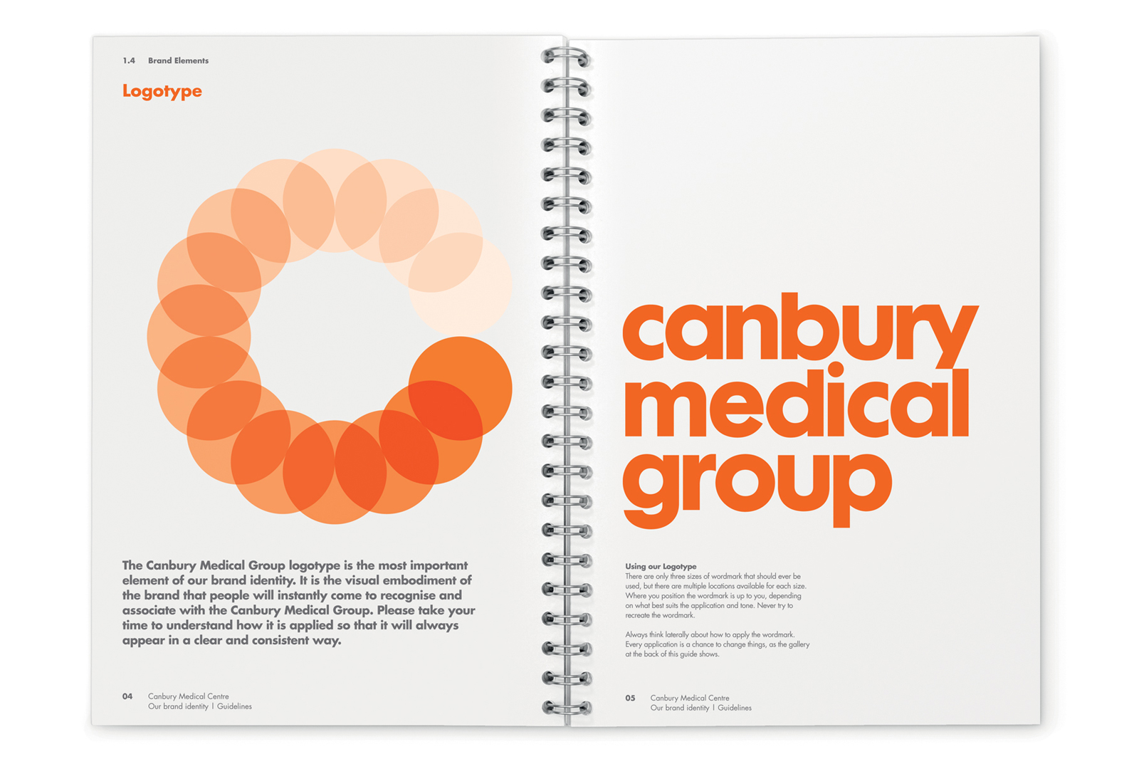
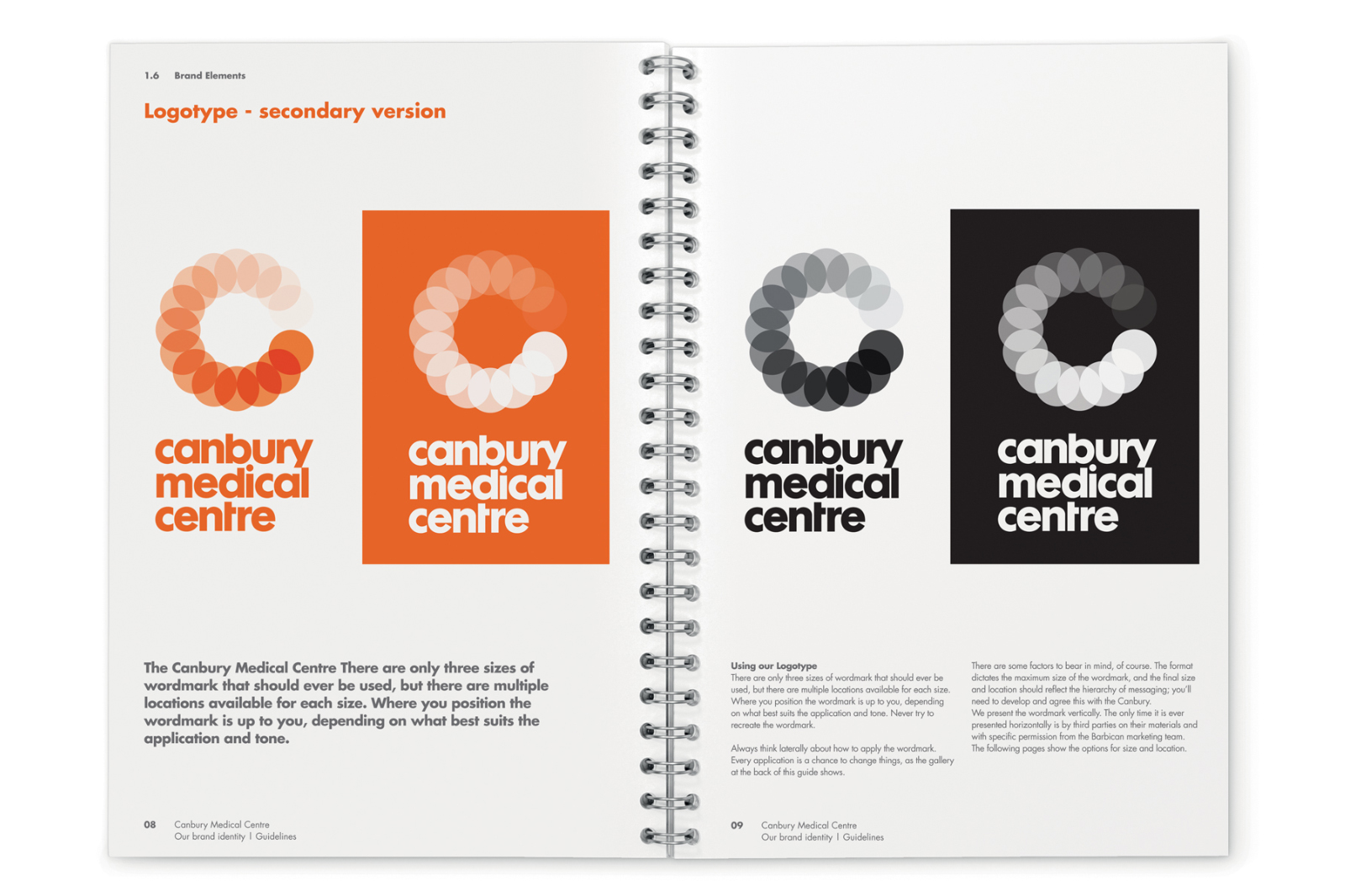
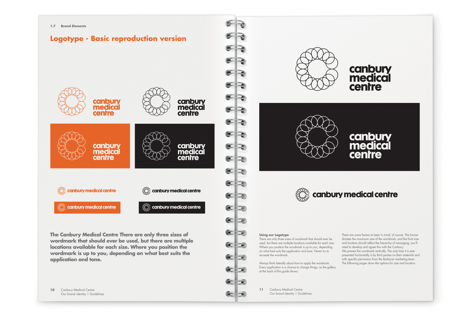
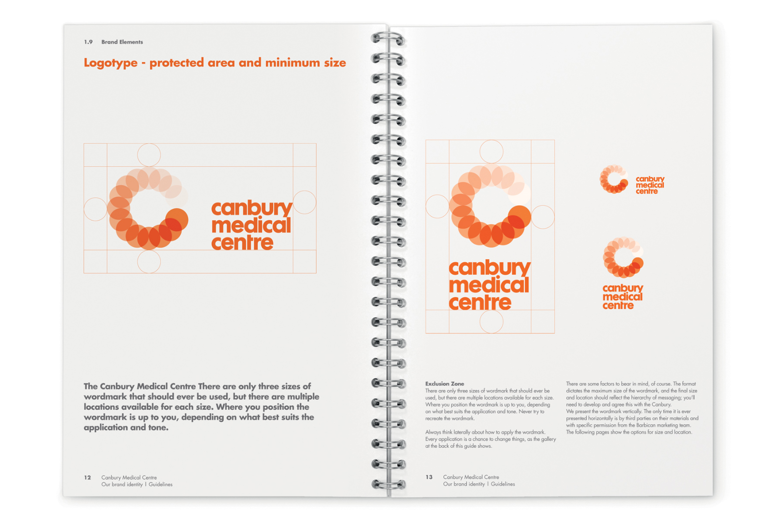
The solution incorporated a graduated and interlocking circles ‘C’ for ‘Canbury’ logo – with flower/sun – pale orange (ill) to full strength orange (healthy) associations.
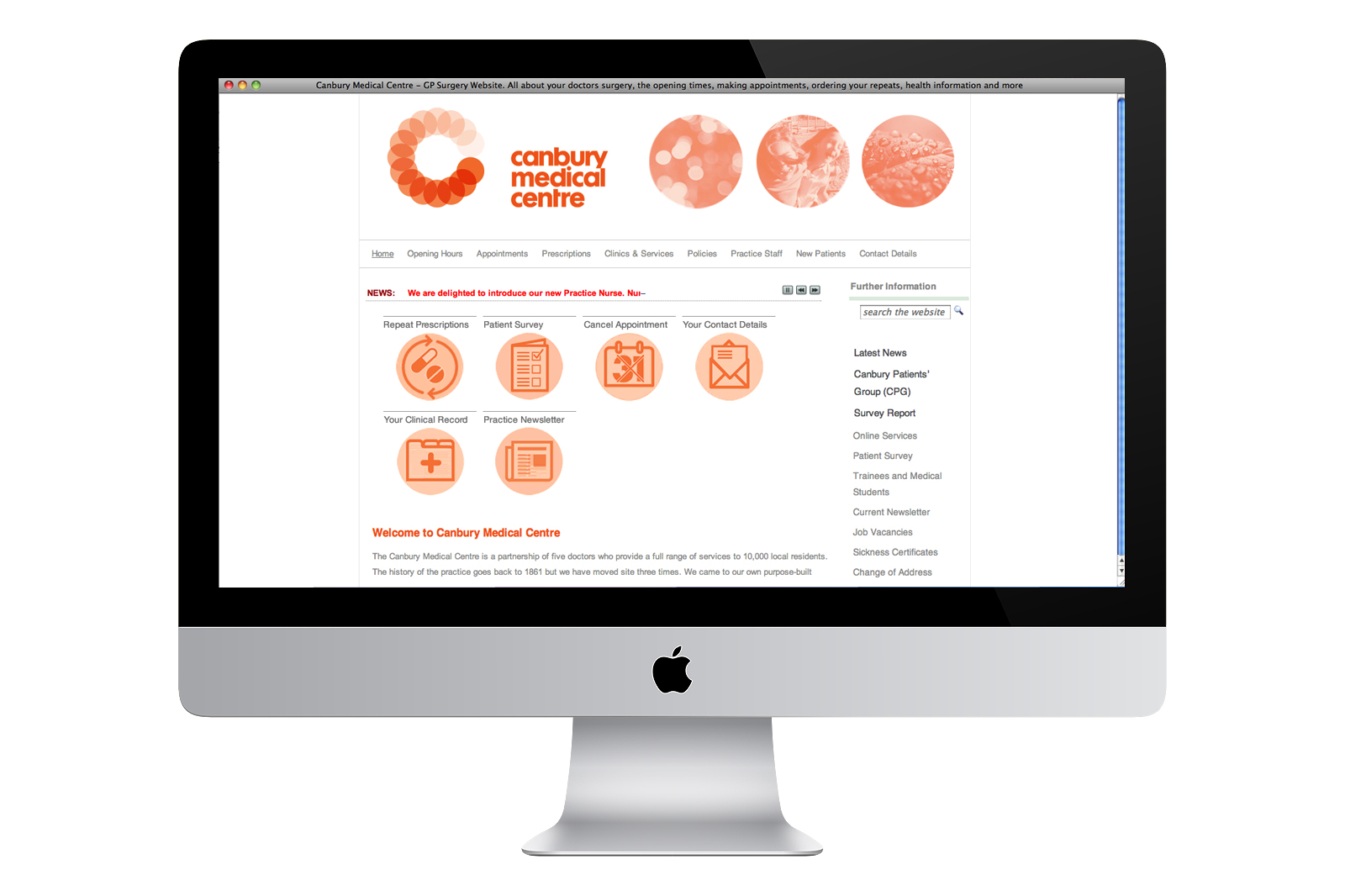
The group’s website was re-branded and redesigned to work alongside an existing NHS web templates system whilst making the key information easier to find i.e bookings and prescriptions.
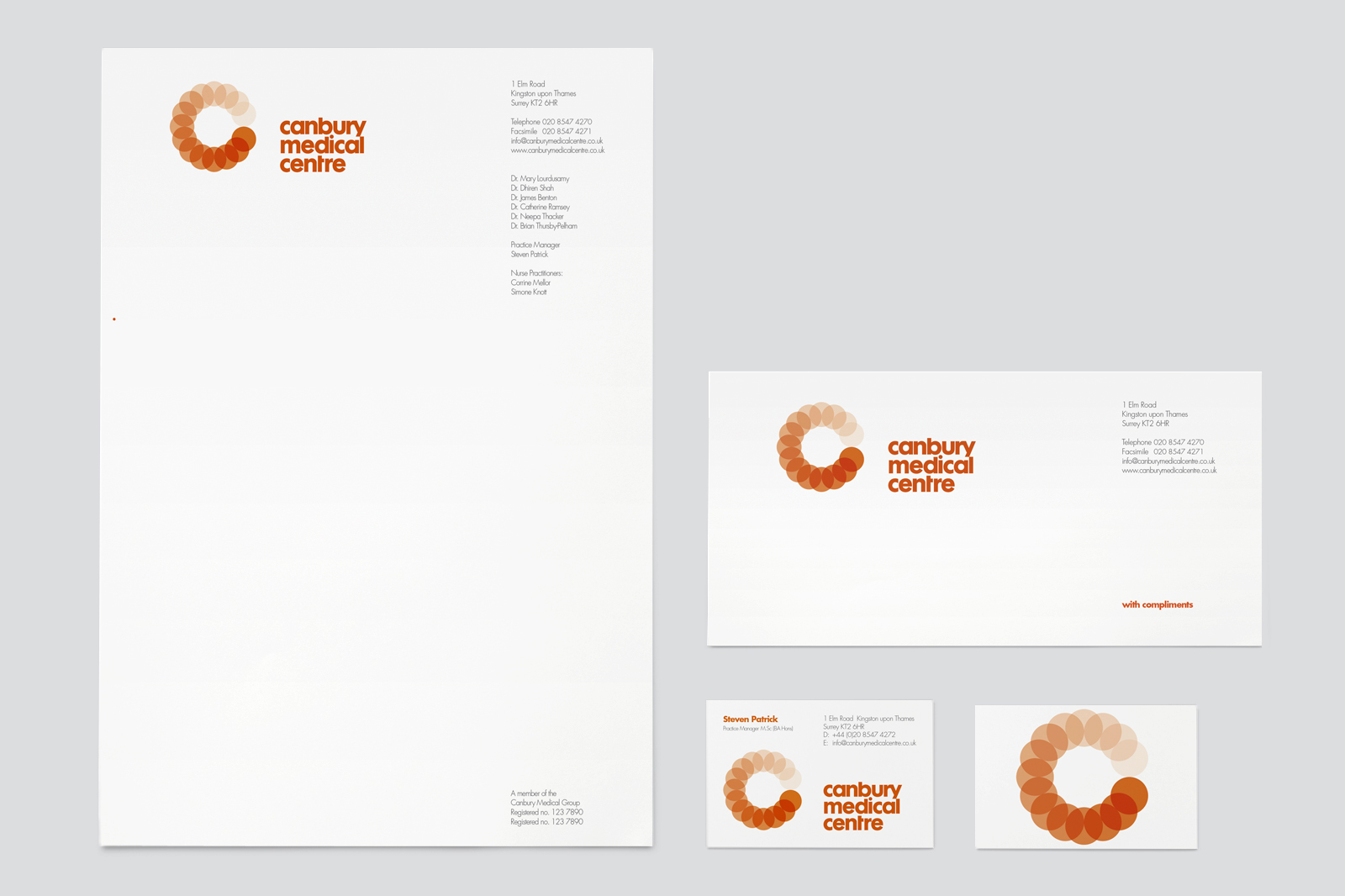
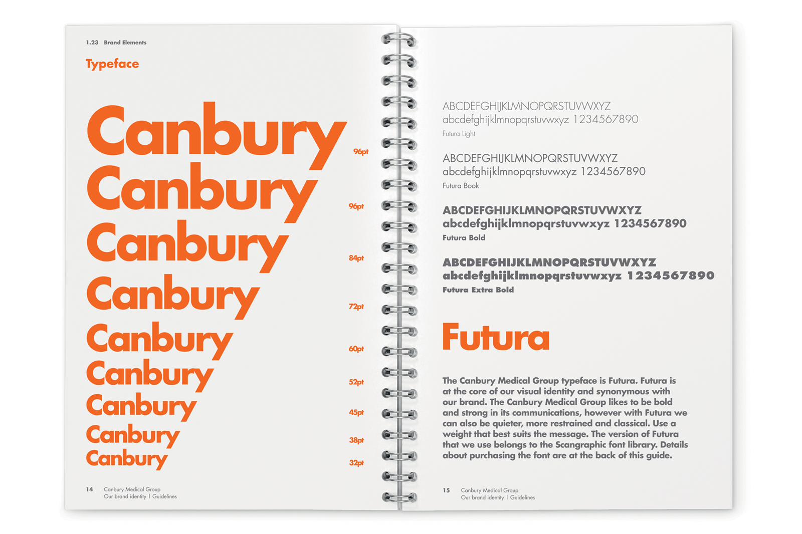
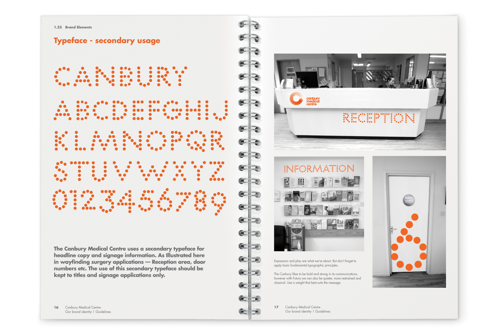
The project evolved into a full branding program — including Brand Guidelines, Marketing and surgery information literature, environmental graphics and signage. A bespoke Dot typeface and bespoke ‘Canbury’ informational icons were created for the website, literature and internal surgery use. The brand is now being introduced into other centres across the Canbury Group.
Canbury Medical Group is an independent group of medical centres whom provide services to over 15,000 people. In an increasingly competitive and commercially driven market with the NHS funding of General practitioners based on the number of patients a surgery cares for – a more focused brand and website was required to compete against the other GP’s and medical centres.
The solution incorporated a graduated and interlocking circles ‘C’ for ‘Canbury’ logo – with flower/sun – pale orange (ill) to full strength orange (healthy) associations.
The group’s website was re-branded and redesigned to work alongside an existing NHS web templates system whilst making the key information easier to find i.e bookings and prescriptions.
The project evolved into a full branding program — including Brand Guidelines, Marketing and surgery information literature, environmental graphics and signage. A bespoke Dot typeface and bespoke ‘Canbury’ informational icons were created for the website, literature and internal surgery use. The brand is now being introduced into other centres across the Canbury Group.